Formal Elements:
Nadav Kander Analysis
|
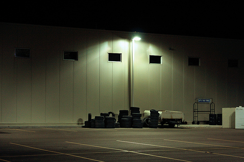
Nadav Kander - Highway Development II
This night time scene is of the underside of a motorway flyover snaking and curving into the distance; a low viewpoint and low horizon have been used making the flyover seem dominating. The scene is lit by what looks like a street light from the left hand side of the composition; there is a uniform, almost black, rich, dark blue sky which dramatically contrasts against the light grey concrete. The flyover is clearly still under construction as it still has wooden shuttering on it's underside. The image is taken from a construction site with no sign of life or vegetation, where there are faint tracks of heavy machinery in the sand and rubble. On the right hand side of the image are two road signs facing away from us. Nadav Kander has taken this image during the night time, but has either installed or used an existing bright light (which is just outside our view) to give cold, glaring illumination to the construction site and motorway flyover. He has also used a low viewpoint which exaggerates the scale and visual impact of the flyover. Kander has used a shot with no signs of life as well as an almost monochrome colour palette, except the slight blue in the sky and the warm brown in the detailing of the motorway underside. Nadav Kander produced several other images of night time motorway flyovers alongside some more varied images in his 'I wish I were near you' series (which are shown to the right). Many of these night time images use low viewpoints alongside bright but often distant street lights, which together evoke a bleak and overpowering mood. This particular image (Highway Development II) uses an almost desert like, lunar landscape with no signs or traces of life, except for the tyre tracks of heavy machinery. Kander has done this to suggest a theme of loneliness, using an almost monochrome colour palette of bright white/grey and bold, dark blue/black sky. The signs which are almost turning away from us underline this idea, adding to the sense of eeriness and alienation. However there is a slight warmth to the motorway flyover, its shape is almost anthropomorphic and snake like. There is a slight touch of colour on the underside of the flyover, the warm brown of the repeated wooden shuttering gives it character. As it winds into the distance, out of view, the viewer is made to wonder where the motorway leads . Kander has used this single touch of colour to show that the motorway leads to somewhere that we would rather be or someone we would like to be with, as shown in the title of the series: 'I wish I were near you'. |
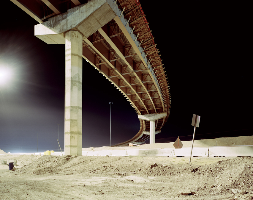
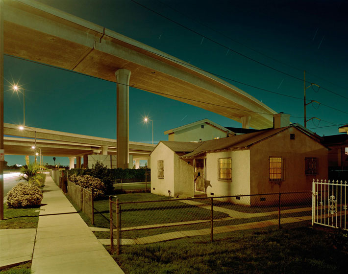
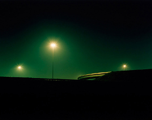
Nadav Kander - I wish I were near you - Highway Development II, Los Angeles, USA
      |
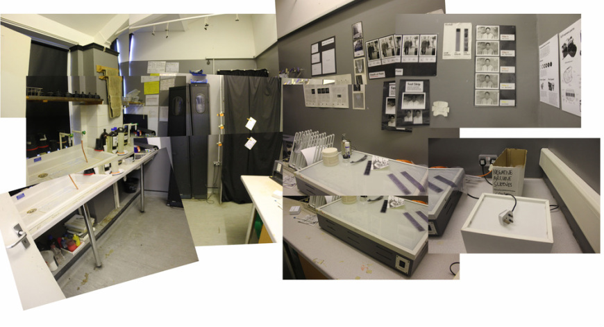
Swimming Pool Contact Sheet
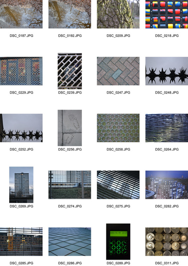
Formal Elements Walk - PatternBelow is a selection of photos that I took to express the formal element of pattern on a walk around my local area; Highbury. The images show a range from urban man made elements to more natural forms, from permanent structures to more temporary effects, such as reflections or rippling water. Once I started looking I could see patterns everywhere, whether they were micro-patterns, such as buttons on a keypad, or macro-patterns, such as the grid like layout of windows in a block of flats. In some of the photographs I manipulated the lighting conditions using a torch to emphasise the light and dark tones which make up the pattern, for example on the wooden woven fence image.
I also found that using the pattern in the foreground and looking through it made an interesting composition. To improve these images, I could develop my knowledge of depth of field and how to manipulate it, as this would make several images more effective.
|
COLOUR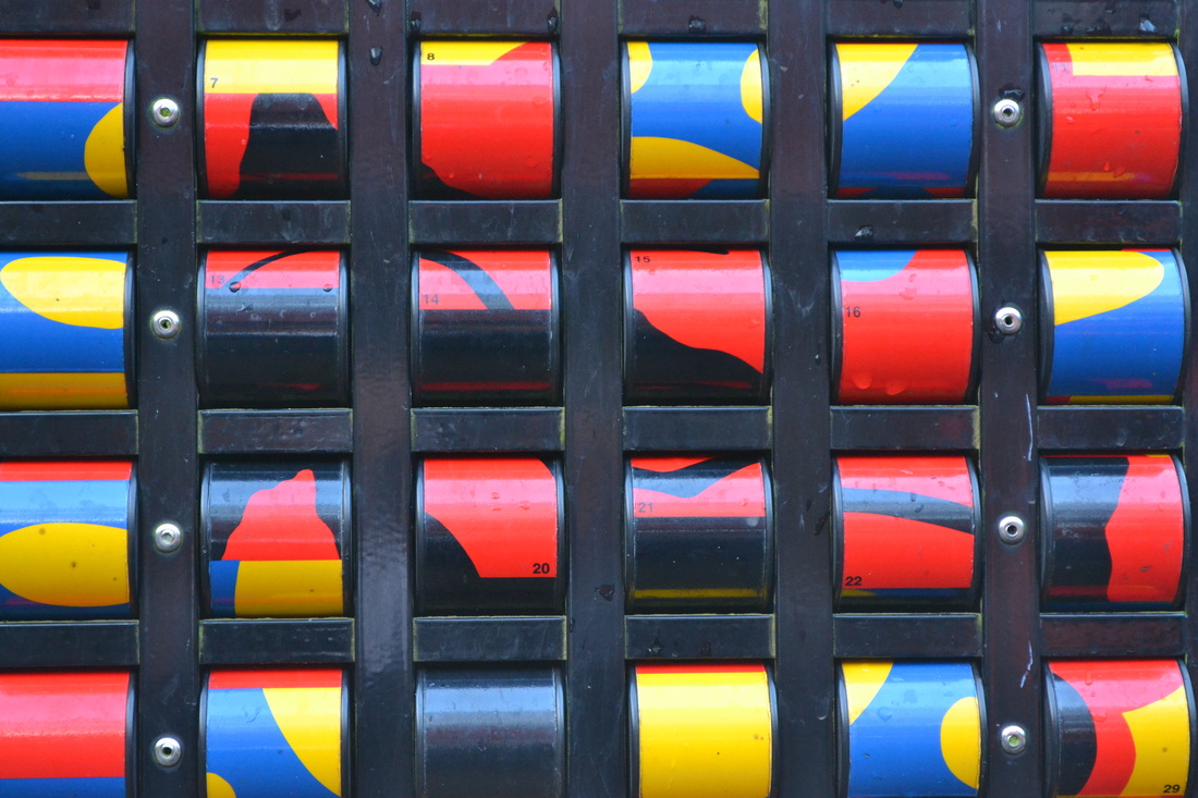
TEXTURE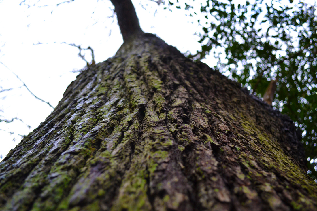
PERSPECTIVE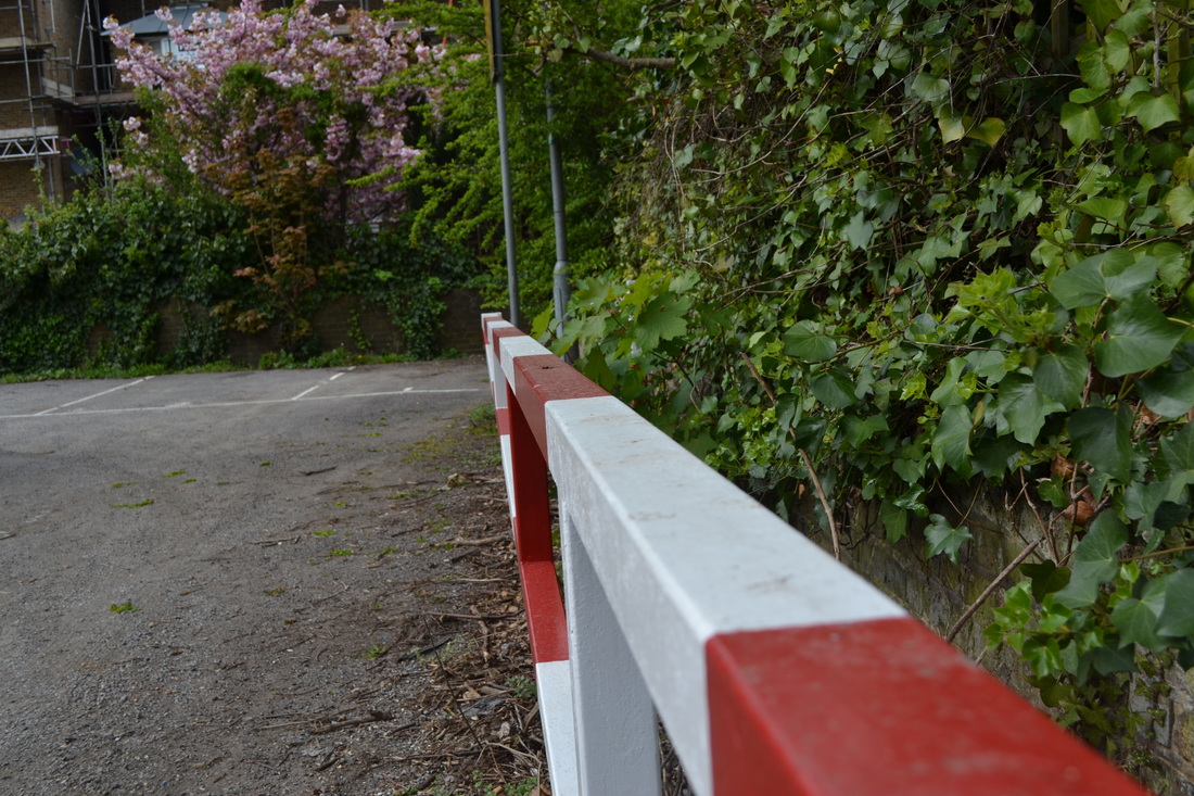
SPACE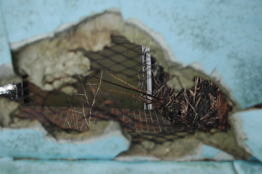
FOCUS
MOVEMENT |
Edits
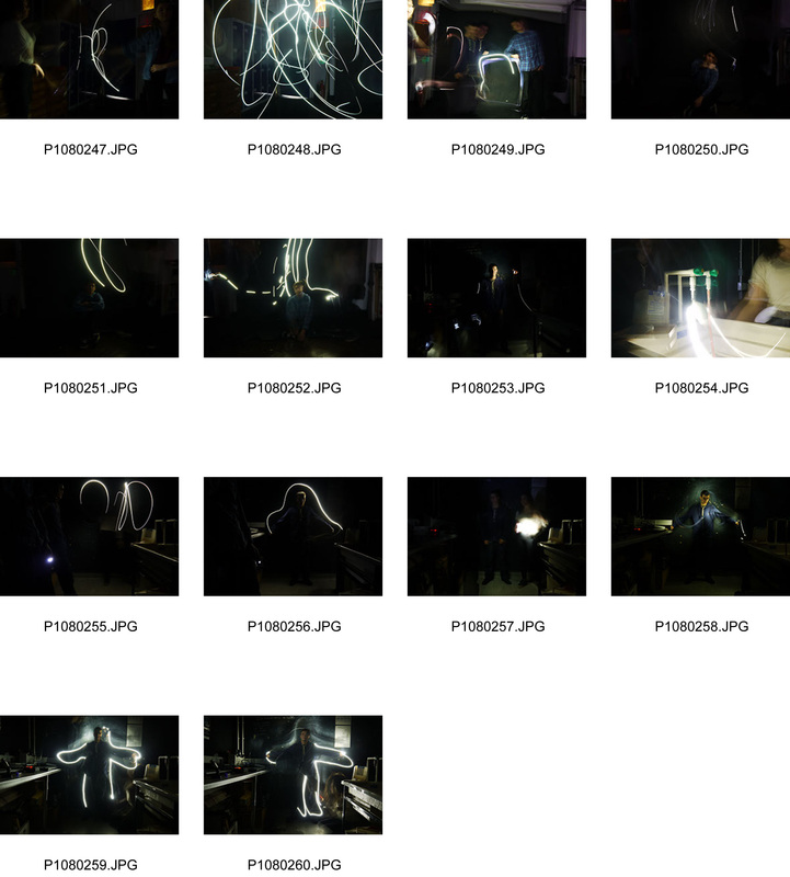
Capturing Moving Light / Long Exposure:
Oliver Hoffmann
|
|
Oliver Hoffmann is an American photographer, he mainly focuses on night time photography, looking at light trails left by busy traffic. In many of his photographs he keeps a stationary source of light to contrast against the otherwise busy scene, for example a traffic light or highly illuminated building.
|
Oliver Hoffmann Response
These photos were taken using an ISO of 600, f16 or f22 and 1/4 to 1/2 of a second. For images 1 to 5 i focused on light trails from cars, i took these images from a bridge and used different angles and shots to put together an interesting spread. Images 6, 7 and 8 were taken from the inside of a car at one of the wing mirrors whilst the car was moving, pictures 7 and 8 capture a range of green, yellow, red, white and blue lighting from traffic lights, car break lights, and from the reflections along the side of the car. Images 9 and 10 were taken from the middle of a busy road, creating an almost symmetrical composition. Here I captured two colours of moving light as well as stationary light from the street lights.
Light Painting
Edits
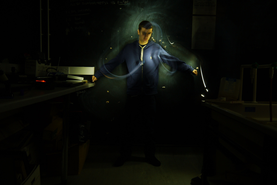
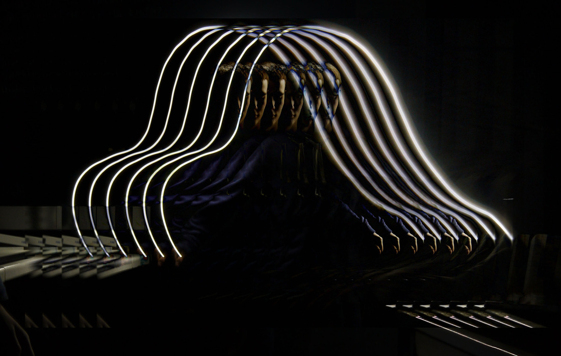
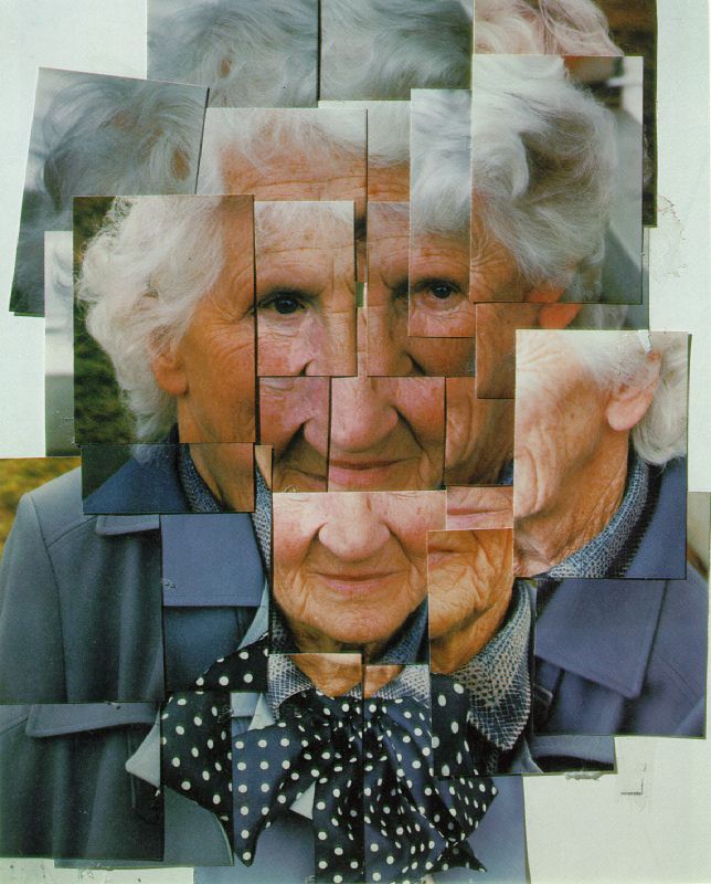
Photo Collage\'Joiners':
David Hockney
|
This image by David Hockney, entitled 'My Mother' is a photo montage of his elderly mother. The image is a multi-viewpoint collage that gives more information than a single perspective view. It is a head and shoulders portrait with little background that fills the image area. Some of the shots are taken closer up than the others giving a variety of focus and detail.
The multi-angle effect has been achieved by the photographer walking 360 degrees around the face taking many varied shots. Hockney has combined these shots, with different lighting, focus and closeness to create an overview of the model, his mother. This artwork is a close up and an observation. It suggests the way we observe somebody closely and wanting to find out about a person by visual means, it takes on a different level of meaning as it is of the artists mother, with whom he was very attached to and who was nearing the end of her life. It could be seen as the artist recording everything about his mother's appearance whilst she is still alive. |
In the early
David Hockney - 'Joiners' Series
David Hockney Response
My London
First Strand: Local ViewsFor this idea I looked at local views, that I see everyday but never take the time to appreciate. The views are not what you would call beautiful but eye catching, they express my local area whilst displaying an attention grabbing composition. Views could range from a view of a close by view of the neighborhood to an alleyway near to home.
Many photographers and artists have done similar work to this idea, expressing the ugliness of the conditions in their hometown or city or capturing the beauty of the area they grew up in. My idea is more personal, and rather than taking images of well known beautiful views or landscapes I have chosen to photograph views that people would not usually think of as beautiful as they see them on a daily basis. I wanted to capture the way that, for example, a tourist would see London and my area. First Set -
|
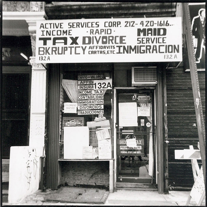
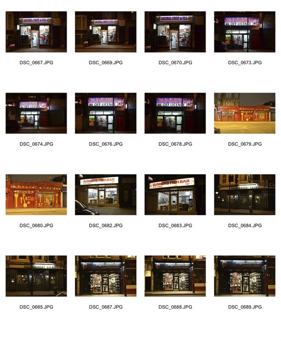
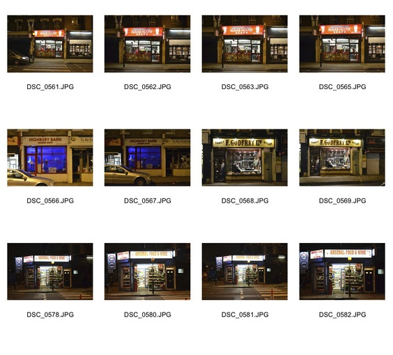
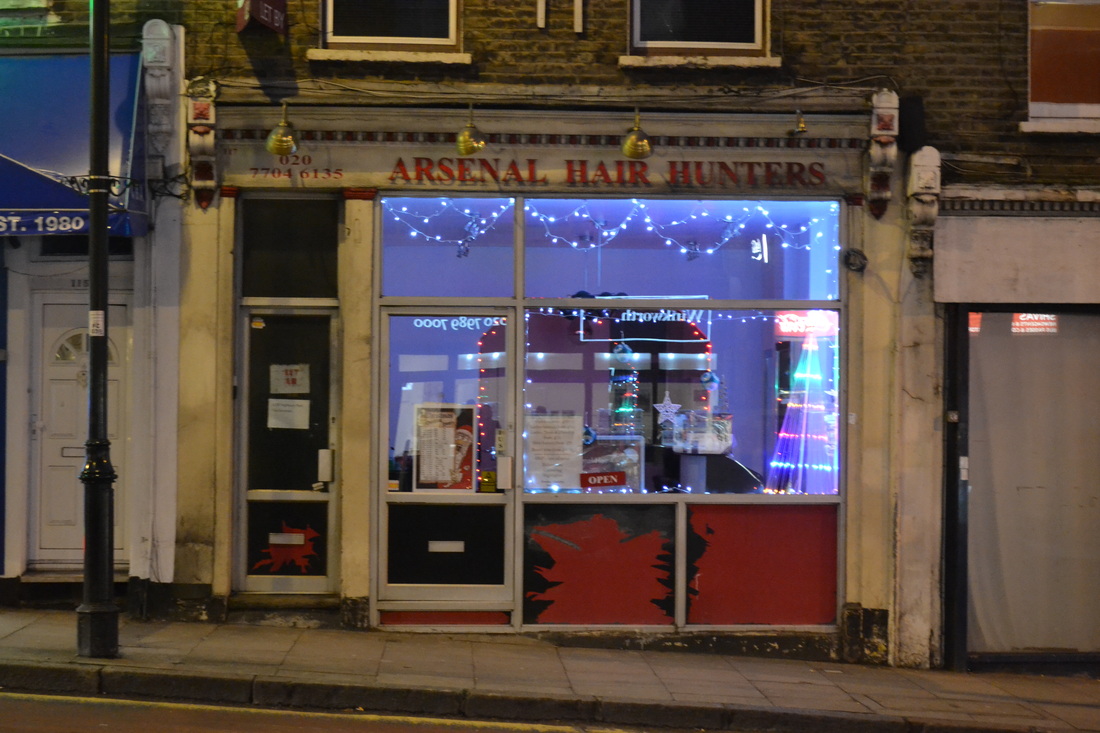
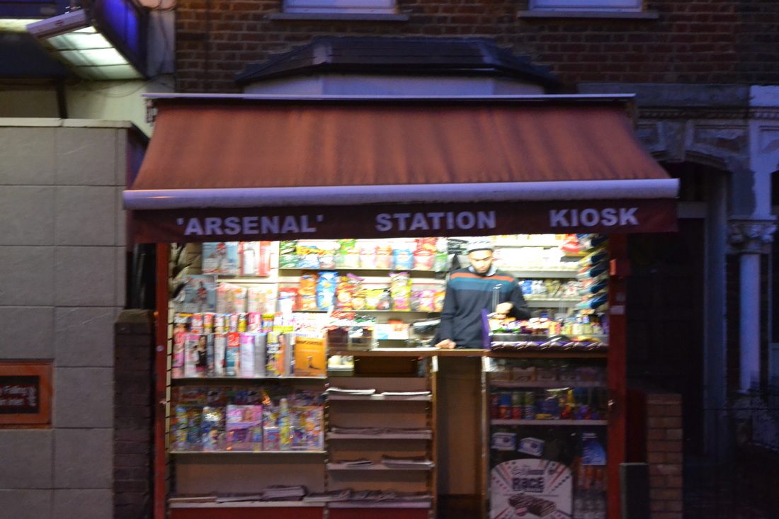
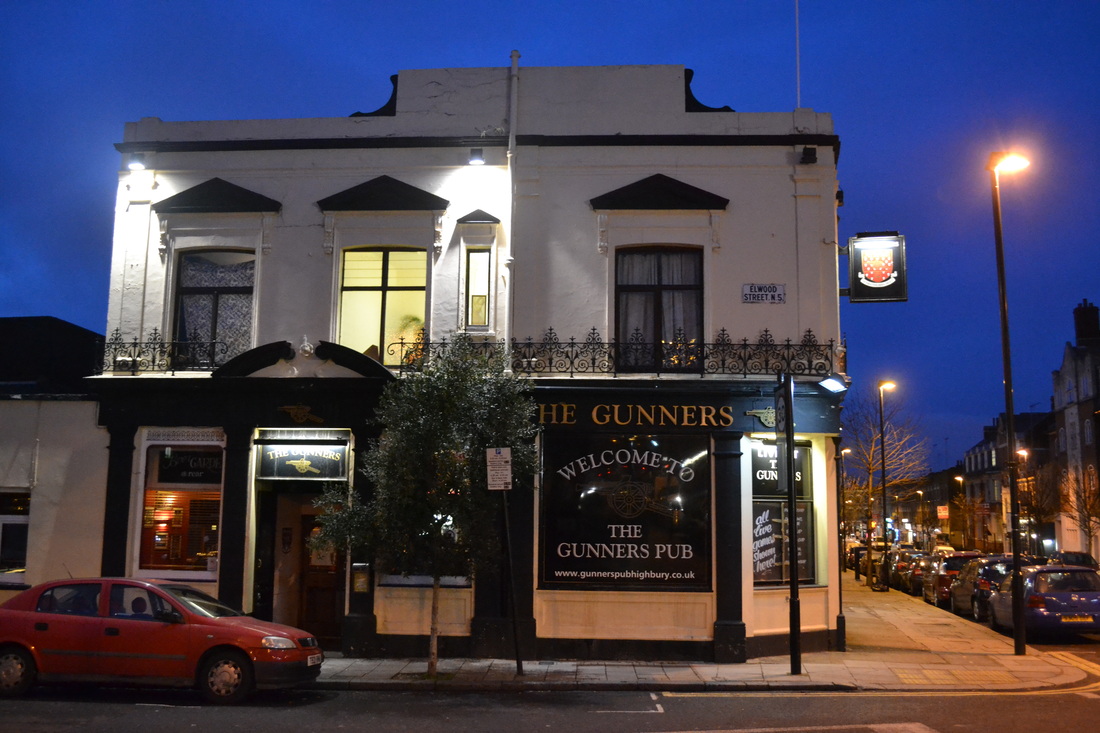
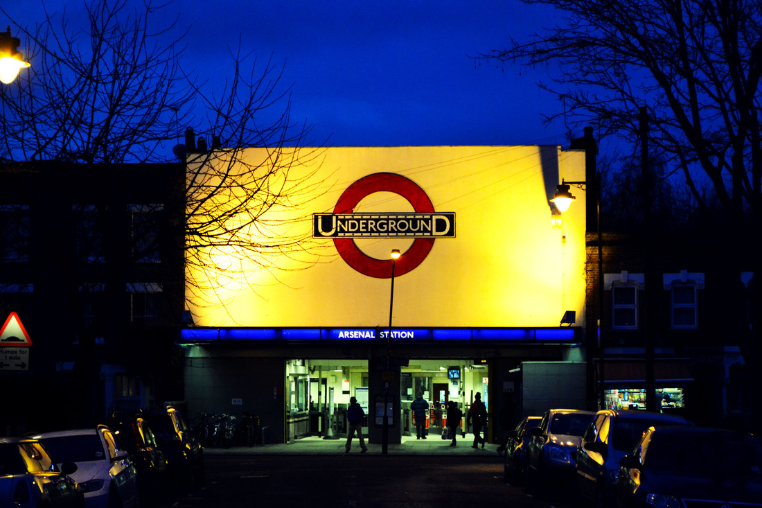
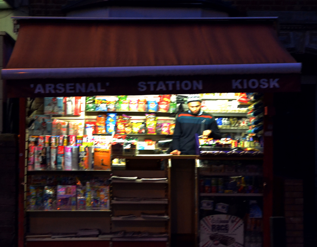
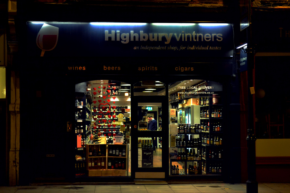
Second Strand - Night Time ShopsFor this idea I focused on shop fronts with a local Arsenal theme, for example 'Arsenal Fish Bar' or 'The Gunners Pub'. I took pictures during the night time as the dark background and illuminated fronts made the composition more interesting and made the shops look more downmarket; giving them more character. However I think that these images could be improved by having a darker background, with more dramatic and colourful lighting.
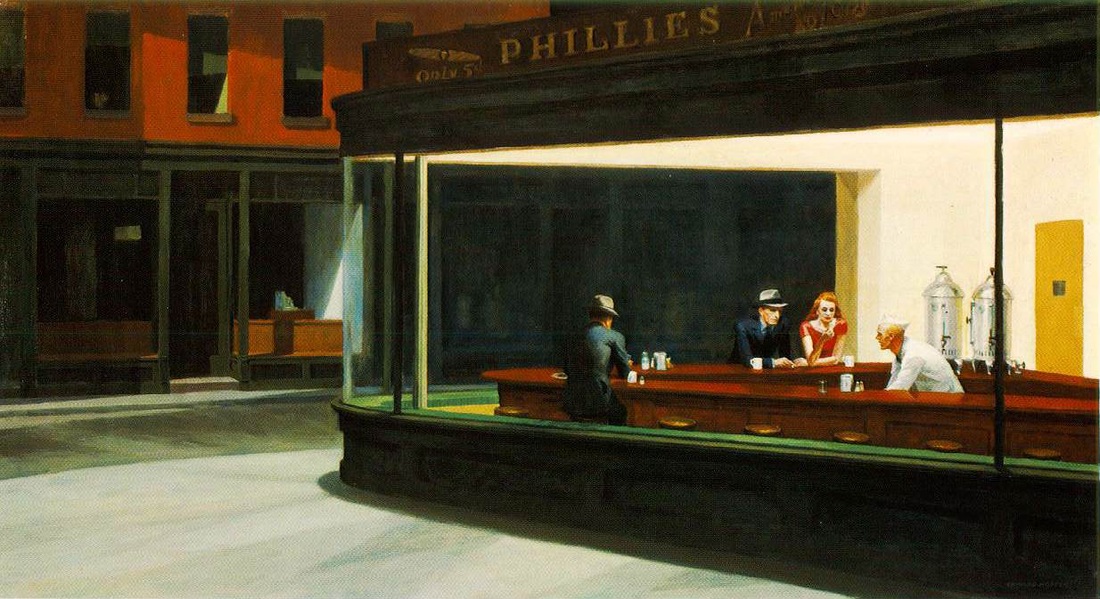
The weak artificial lighting of the shop signs gives an eerie and alienating atmosphere, there are people but they are less important than the buildings and their lighting. For a highly populated city like London there are remarkably few people in these shots. this gives a haunting feeling of loneliness, similarly to the ambiance of the paintings of Edward Hopper.
First Set - Local Shops
   Edits
      Second Set - Neon Signs
By editing my earlier photos as well as some new shots, changing the brightness and exaggerating the coloured highlights using the 'colour balance tool' on photoshop I found that it was the interior light of the shops that gave them a sense of individuality against the darkness of night. To emphasise this effect I decided to photograph shops with illuminated signs and coloured interiors, that are preferably run down as this would reflect the theme of Zoe Leonard's series.
Edits
I developed this idea by piecing together my earlier images with new shots, I chose the images of shops which had illuminated signs. When viewed as a set or series the images were more stronger and effective, I particularly liked the range of colours in the different signs and the varied effects that the interior lighting had on the appearance of the shop. I edited these photos by turning down the brightness and altering the colour balance, often increasing the green in the highlights and the blue in the shadows to make the lighting more dramatic.
Third Strand - London by CarThis idea will focus on little known 'local landmarks' that I think express the feel of my area.
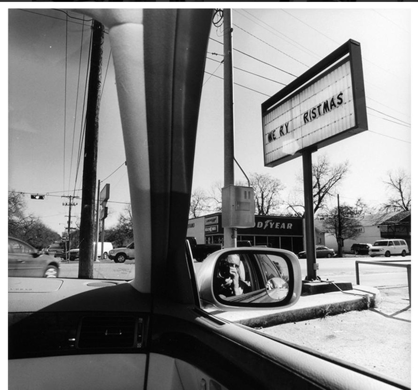
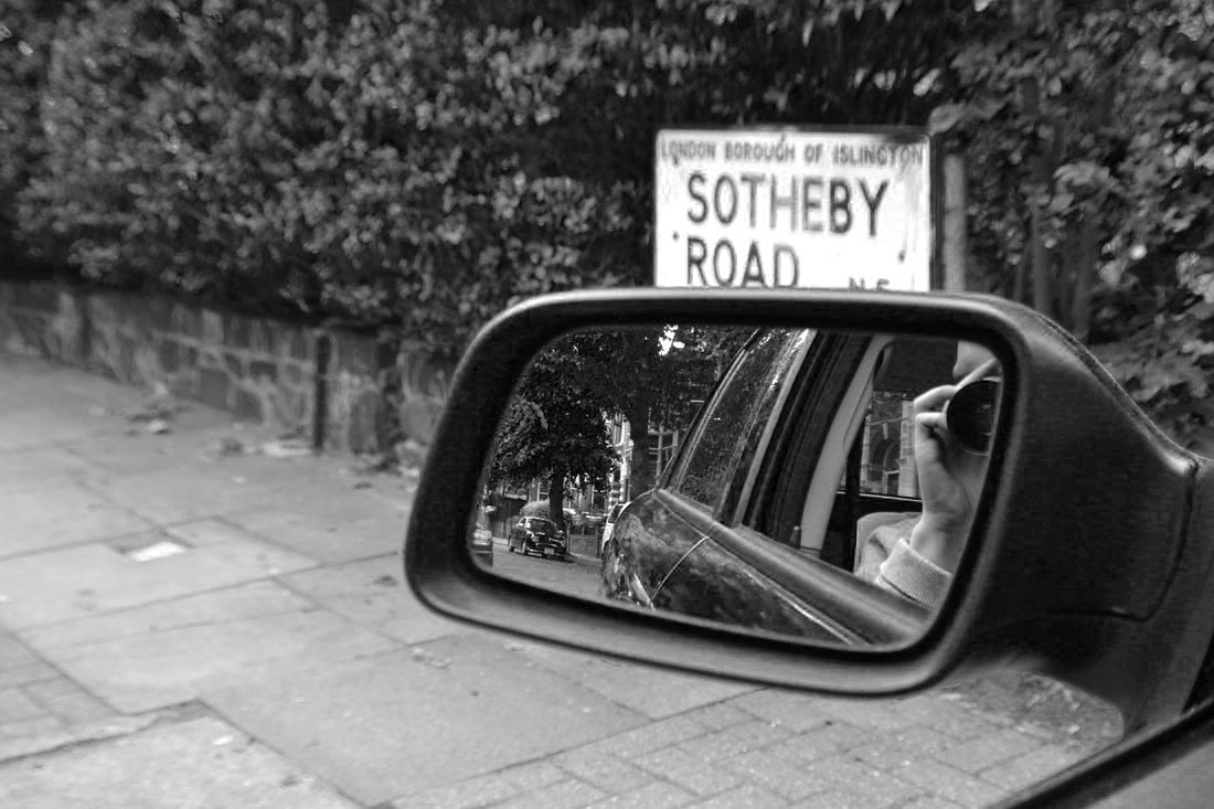
This idea was inspired by my previous pictures for the Oliver Hoffmann response (images 6, 7 and 8), I both enjoyed taking these pictures and was pleased with how they turned out. I thought that the interior of the car made the composition more aesthetically pleasing as it separated the view into different sections, allowing the viewer to pay better attention to detail. Lee FriedlanderAfter research I found an artist; Lee Friedlander which used similar compositions, I liked the way that he captured an all round view of his subject matter by using the views through a wing mirror and wind screen and thought that this could develop my idea.
Initial Response - Using Reflections
First Set - Local LondonFraming Subject Matter / Using Reflections
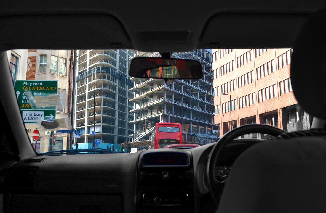
The reflected view in some of these images image could be improved as they do not add to the main composition. To improve this set of images I could capture a deeper meaning of the subject matter in the wing mirror reflection, for example showing a bright depiction of an area with it's hidden ugly side in the mirror. I could develop the composition further by capturing myself taking the image in the mirror more, similarly to Lee Friedlander in some of the compositions in 'America by Car', which helps to remind the audience of the setting of the image, bringing the photographer and subject matter together. I would also like to make more use of the shapes of the car's interior, developing the images by using it's structure as frames or to divide up different areas in the composition.
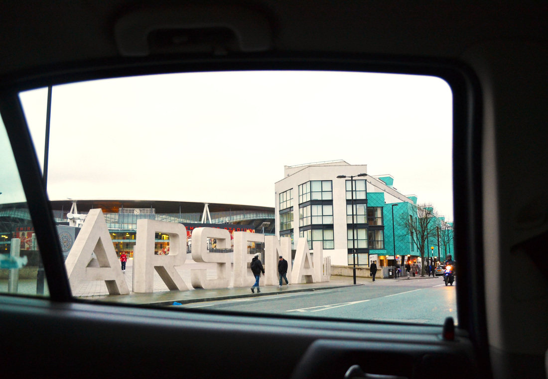
EditsThe most successful images in my first set were the image of the Arsenal stadium and the image of Highbury church and clock-tower. The image of the 'Arsenal letters' was strong as the shape of the silhouetted window brought out the clear perspective in the image and the clock-tower image worked well due to the visual conundrum created by casting the distant reflection in the wing mirror against the heavy close up view of the clock-tower. These techniques will be used in further photographic sets.
Second Set - Framed Shots
EditsColour Editing
I experimented with changing the colour tones and black and white in my images to highlight particular areas of focus within the framed compositions, created by photographing inside the car. I aim to make the reflection in the rear view mirror more interesting to improve the strength of my compositions, perhaps the mirror could reflect the overall feel or darker side of the main windscreen view.
Developing Subject Matter - Frequently Visited PlacesI plan to develop my subject matter by capturing shots of 'frequently visited places', which will not only brings up a clearer meaning under my theme of 'My London', but helps to expand my subject matter from local shots, to images expressing my experience of London. I aim to capture buildings and areas that have a sentimental meaning to me and that capture the feel of different London boroughs.
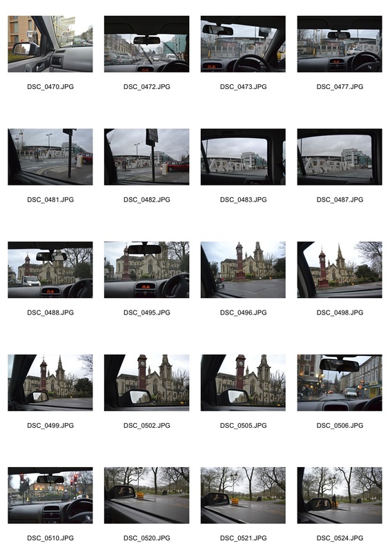
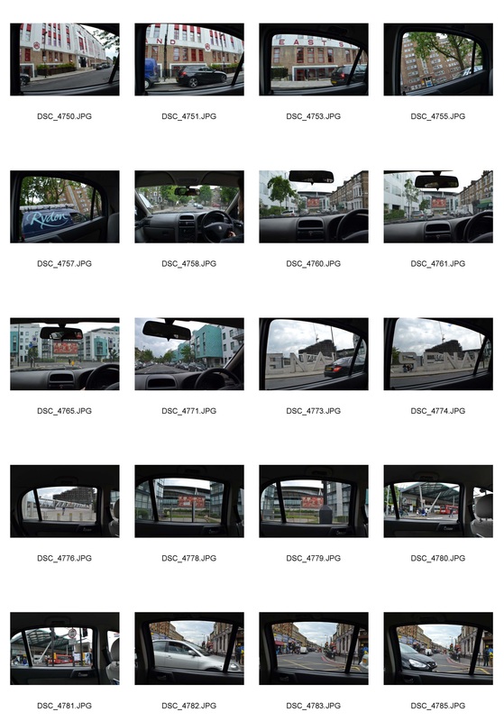
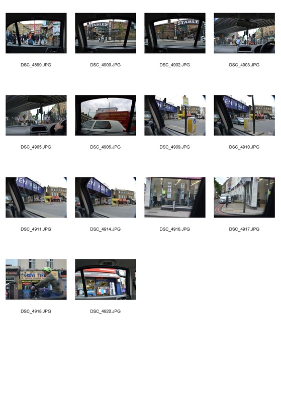
Third Set - Finsbury Park
My first set taken with the idea of 'frequently visited places' kept in mind was of Finsbury Park, one of my neighbouring areas. I aimed to capture images of well known buildings, such as the train station, bus interchange and the parade of shops along Blackstock Road, as well as images of sights and shops that help express the feel of Finsbury Park and the people that live there.
This is an area I visit almost daily on my trip to college every morning and afternoon, I wanted to capture everything note-worthy that I would realise in an everyday visit and present it to the viewer.
Edits
Edits - Black and White
I set some of these images into black and white, similarly to Lee Friedlander, to not only give a break from the majority of colour images, but to emphasise the structure within the composition. This change also helps to create a form of distance from the everyday appearance of these images, making the viewer look closely at the details in the image and capture the different elements in the 'freeze-framed' image.
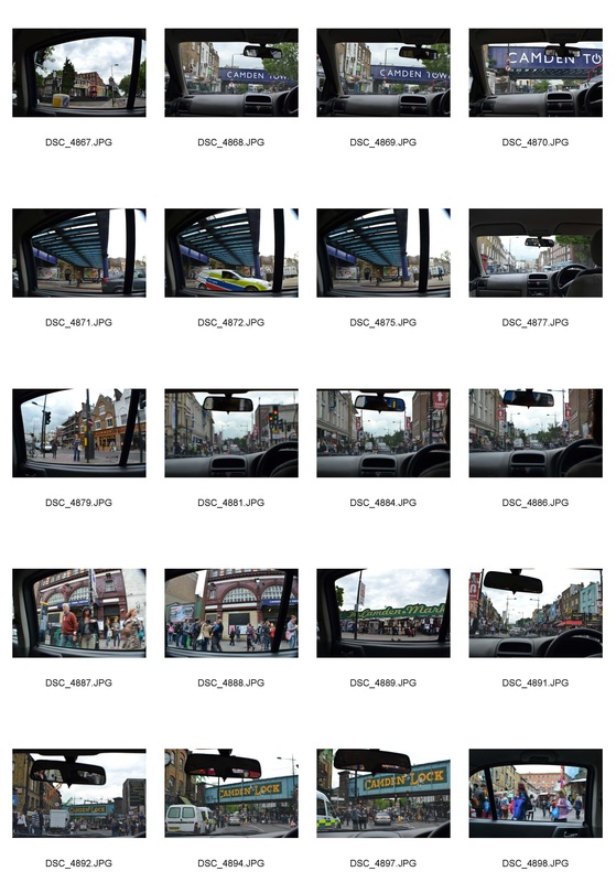
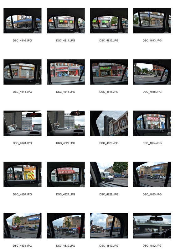
Fourth Set - Camden
In contrast to Finsbury Park, many different people visit Camden as a leisure destination, I aimed to capture scenes of it's busy diversity of people as well as the locations it is best known for. I captured scenes that I would expect to encounter on a normal visit to the borough of Camden.
I experimented with using different camera angles within the car to alter the shape cast by the structure of the car. As I got used to this technique i began changing the framing shapes cast by the car to suit the focus of the image, creating better compositions.
In this set I captured shots where the location was made evident by signs, with subject matter such as Camden overground, Camden station, Camden lock and Camden market. Many of the images below have wide ranges of bright colours, which help to highlight the busy feel of the area and I have exaggerated these colours by altering the colour balance and vibrancy to bring out certain colours.
Edits
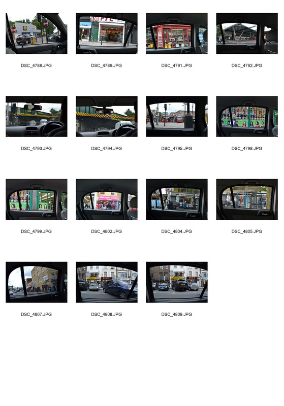
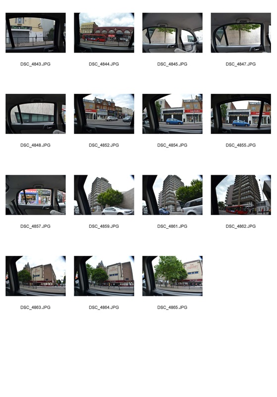
Fifth Set - Holloway
Holloway is dominated by the congested and polluted Holloway Road, stretching from Highbury to Archway. It is lined with low rise, low status shops, bookies, payday lenders and pound stores, broken up by a few landmark buildings such as the modernist Met University, Odeon Cinema and Archway Tower. These nondescript shops almost ask to be driven past at speed, I tried to capture this drive by anonymous mood within my images.
In this set I experimented further with the different viewpoints and camera angles I could achieve within a car, for example extreme low angle shots capturing shapes of the car roof in images of high rise buildings, or shots through the windscreen and side windows, creating a wide, almost panorama like view through the structure of the car.
Edits
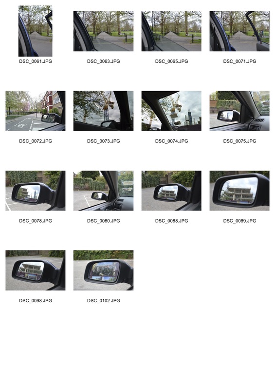
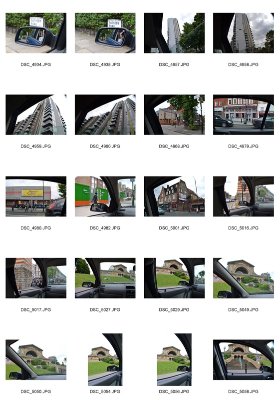
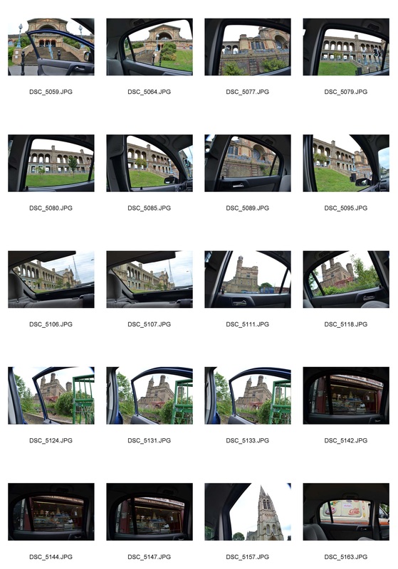
Sixth Set - Manor House and Alexandra PalaceTo round of my developing series of frequently visited places I photographed Alexandra Palace; a landmark nearby my college, Manor House; another neighboring borough where I have visited to see friends and Stoke Newington Church, a local landmark.
In this set I captured images using a variety of angles, some of which I haven't used before, to frame the subject matter in different ways. I took more images through the rear window and images through the back windows from the front seat, creating different silhouetted shapes with the structure of the car.
Selects
EditsIn some of these images I exaggerated the colour and vibrancy to create a larger contrast between the view and the framing structures in the car. To reduce the vast white areas of sky in some images I added detail by decreasing the brightness and increasing the contrast of the sky.
Final Reflection Series
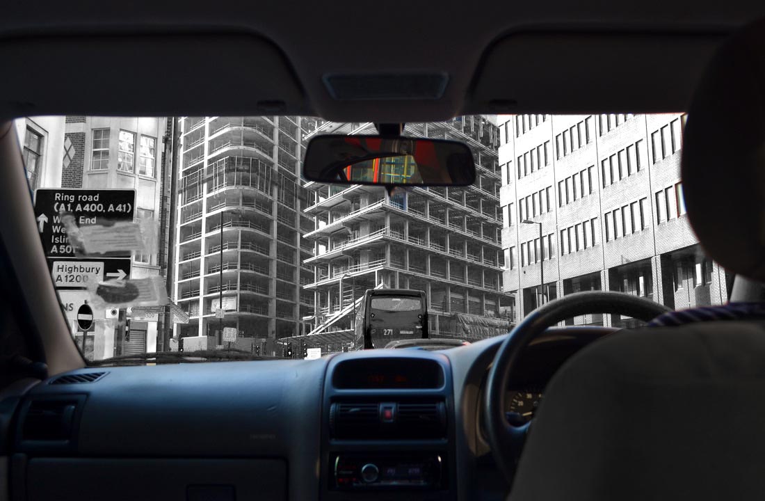
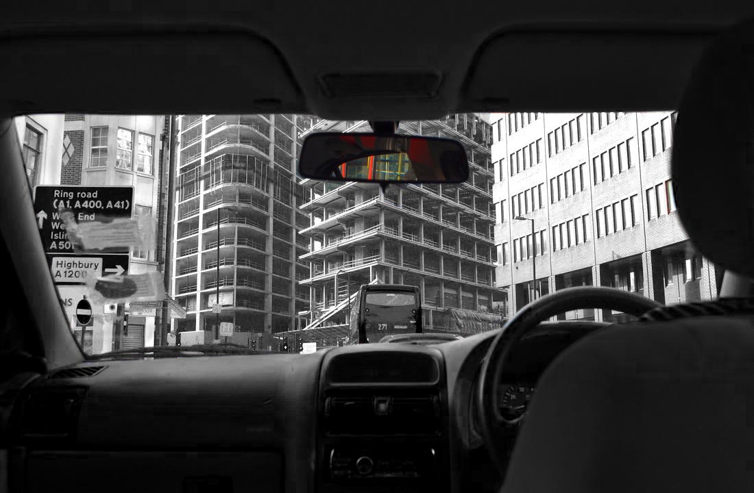
For these series I developed my previous idea, of drawing attention to particular areas of the composition using colour against black and white, using images taken throughout this project containing reflections captured in the rear and wing mirrors. This splash of colour against the monotone windscreen view helps to highlight the alternate viewpoint, creating a clearer contrast between the two views. To develop these images I could splice a more contrasting view, such as the city and countryside, to emphasise different ideas and themes.
Final Black and White Series - 'Frequently Visited Places'
I set my final series into black and white to help present them as a unified set of images. Below is a series of twenty images chosen from throughout the 'My London' project. Some images were chosen because of their formal elements, which create strong compositions, such as the impressive volumes and intense shadows of my images of Alexandra Palace or Stoke Newington Church. Others were chose as they depict evocative stills of an area, with chance reflections or cleverly framed subject matter.
The images below have been put in order depending on their location, in order to create the impression of a journey through my frequently visited places. |